Q: 2 ggplot2で積み重ね棒グラフに値を表示させたい
2016/04/12追記: ggplot2 v2.1.0に対応するため、一部コードを修正しました
本記事は ggplot2逆引き プロジェクトの一環として、Stack Oveflow の下記記事を翻訳したものです。
r - Showing data values on stacked bar chart in ggplot2 - Stack Overflow
2.1 Q
ggplot2で積み重ね棒グラフに値を重ねて表示したいです。私が試したのは以下のコードです:
2016/04/12追記: ggplot2 v2.1.0でqplot()の仕様が変更されているようでしたので、ggplot()で描くように修正しました
Year      <- c(rep(c("2006-07", "2007-08", "2008-09", "2009-10"), each = 4))
Category  <- c(rep(c("A", "B", "C", "D"), times = 4))
Frequency <- c(168, 259, 226, 340, 216, 431, 319, 368, 423, 645, 234, 685, 166, 467, 274, 251)
Data      <- data.frame(Year, Category, Frequency)
library(ggplot2)
p <- ggplot(Data, aes(Year, Frequency, fill = Category)) +
  geom_bar(stat = "identity") +
  theme_bw()
p + geom_text(aes(label = Frequency), size = 3, hjust = 0.5, vjust = 3, position = "stack") 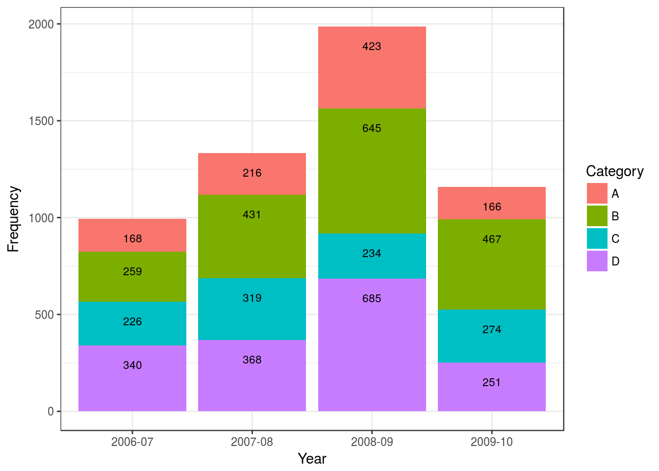
でもこのデータの値を、各部位の中央に配置したいのです。お願いします。
2.2 A
一つのやり方として、各バーのミッドポイントを算出するというのがあります:
library(plyr)
library(ggplot2)

# calculate midpoints of bars (simplified using comment by @DWin)
Data <- ddply(Data, .(Year), transform, pos = cumsum(Frequency) - (0.5 * Frequency))

# plot bars and add text
p <- ggplot(Data, aes(x = Year, y = Frequency)) +
     geom_bar(aes(fill = Category), stat="identity") +
geom_text(aes(label = Frequency, y = pos), size = 3)library(plyr)
library(ggplot2)
Year <- c(rep(c("2006-07", "2007-08", "2008-09", "2009-10"), each = 4))
Category <- c(rep(c("A", "B", "C", "D"), times = 4))
Frequency <- c(168, 259, 226, 340, 216, 431, 319, 368, 423, 645, 234, 685, 166, 467, 274, 251)
Data <- data.frame(Year, Category, Frequency)
# calculate midpoints of bars (simplified using comment by @DWin)
Data <- ddply(Data, .(Year), transform, pos = cumsum(Frequency) - (0.5 * Frequency))
# plot bars and add text
p <- ggplot(Data, aes(x = Year, y = Frequency)) +
geom_bar(aes(fill = Category), stat="identity") +
geom_text(aes(label = Frequency, y = pos), size = 3)
p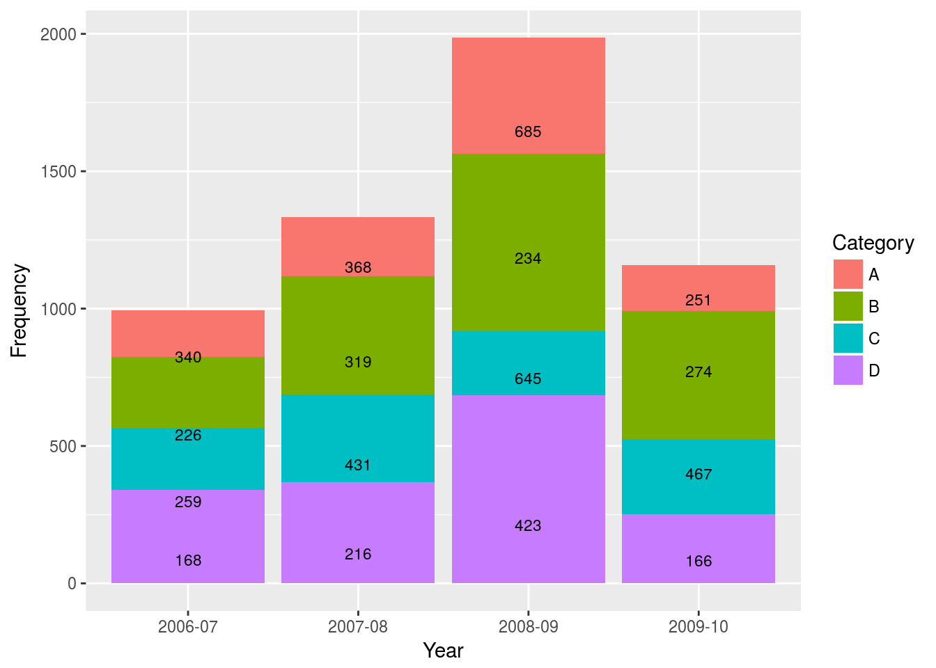
データフレームにあらかじめ値を配置する高さ(y値)を算出して変数として追加し、geom_text(aes(label = Frequency, y = pos))とその変数を指定すれば、そのラベルは算出した位置に配置されます。
2.3 補足
上記のAの方法は、データフレームに新たに変数を追加することとなります。それを避けて(だいたい)真ん中にくるようになればいい、というのであれば、以下のようなコードでも可能です:
p <- ggplot(Data, aes(x = Year, y = Frequency)) +
  geom_bar(aes(fill = Category), stat="identity") +
  geom_text(aes(label = Frequency), size = 3, position = "stack", vjust = Frequency/75)
p
これは、geom-textのvjustに対して設定を加えています。このようにy値の変数を定数で補正したものをvjust =に投げると、割合的にずれてくれるようになります。
ただこの方法ですと、その補正する定数をどう設定したらど真ん中にくるか、はっきりとはわかりません。詳しくはRPubs - vjustのテストをご覧ください。
また、この記事の元となっているStackOverflowの記事には、Hadley Wickham氏による以下のコメントがあったことも付記します:
Please don’t. It’s not a good idea to try and improve a confusing visualisation by adding text labels. Either make a table or use a better display of the data. – hadley Jul 12 ’11 at 1:10